
No project with this tag.

No project with this tag.
Visual identity for a café
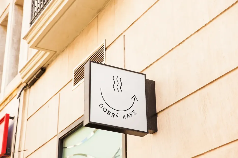
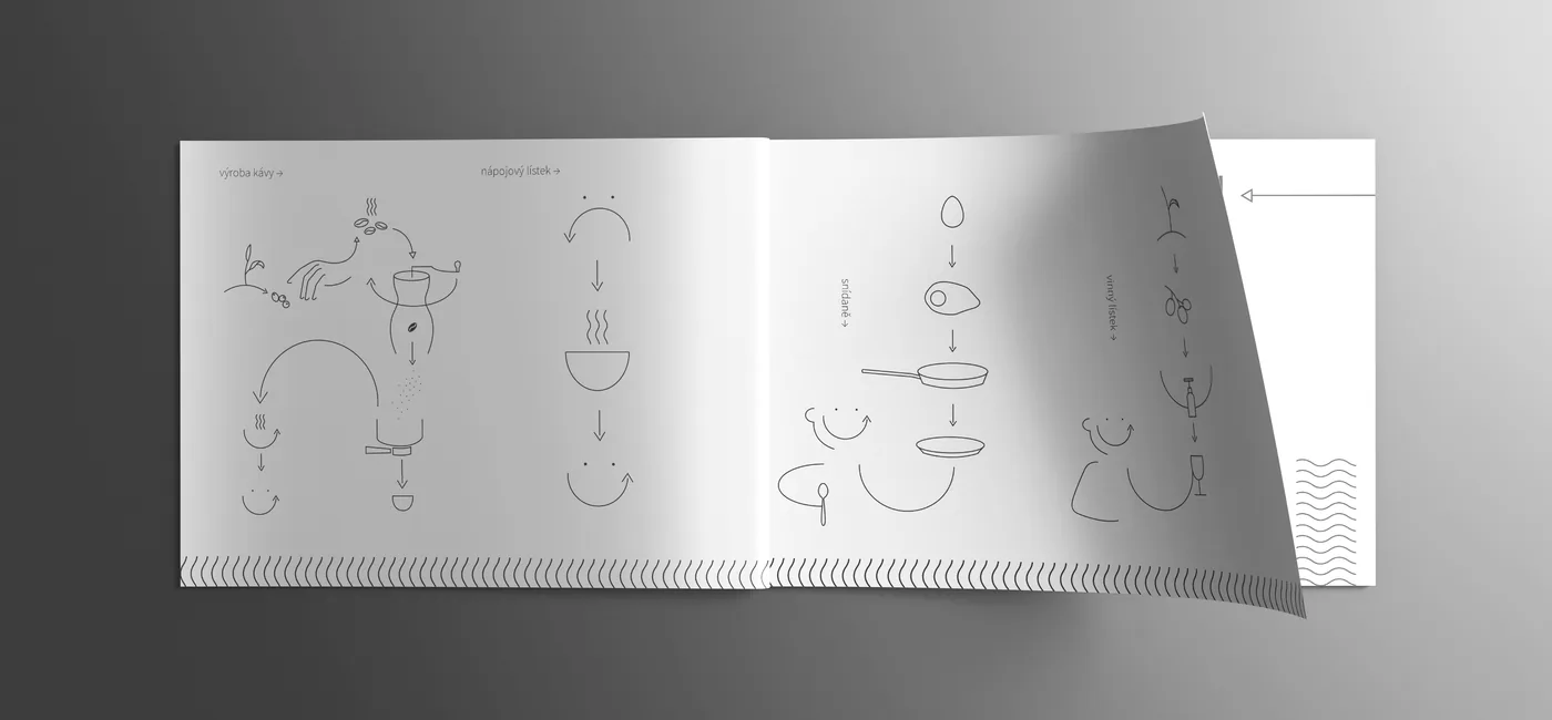
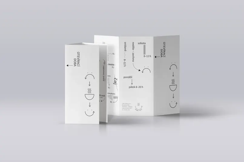
For the café Dobrý kafe in Pardubice I created a new visual identity, which the café has been using from 2018 to this day. I started from the informal name Dobrý kafe — colloquial Czech for “good coffee” — and tried to build a visual style that would feel friendly and informal while staying modern and simple.
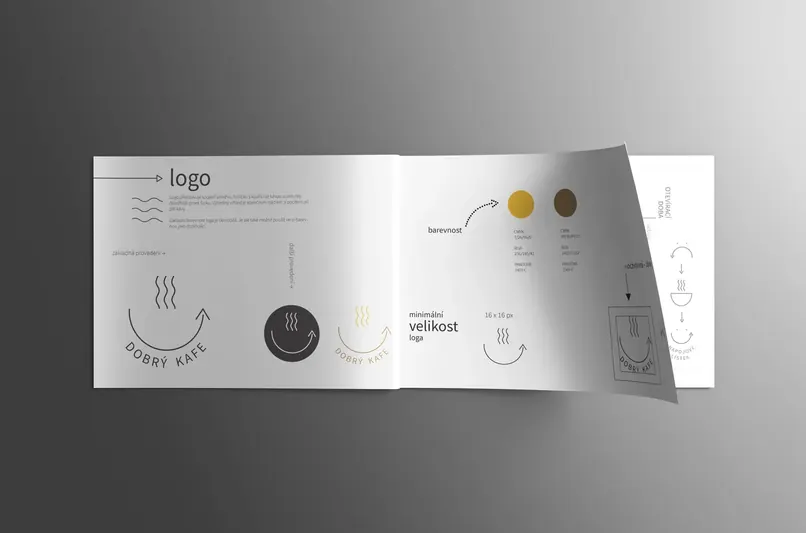
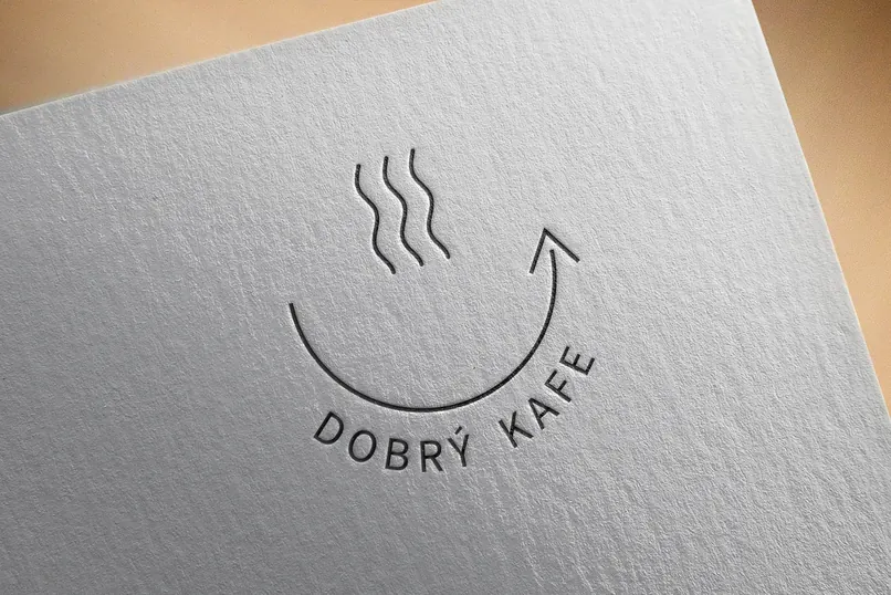
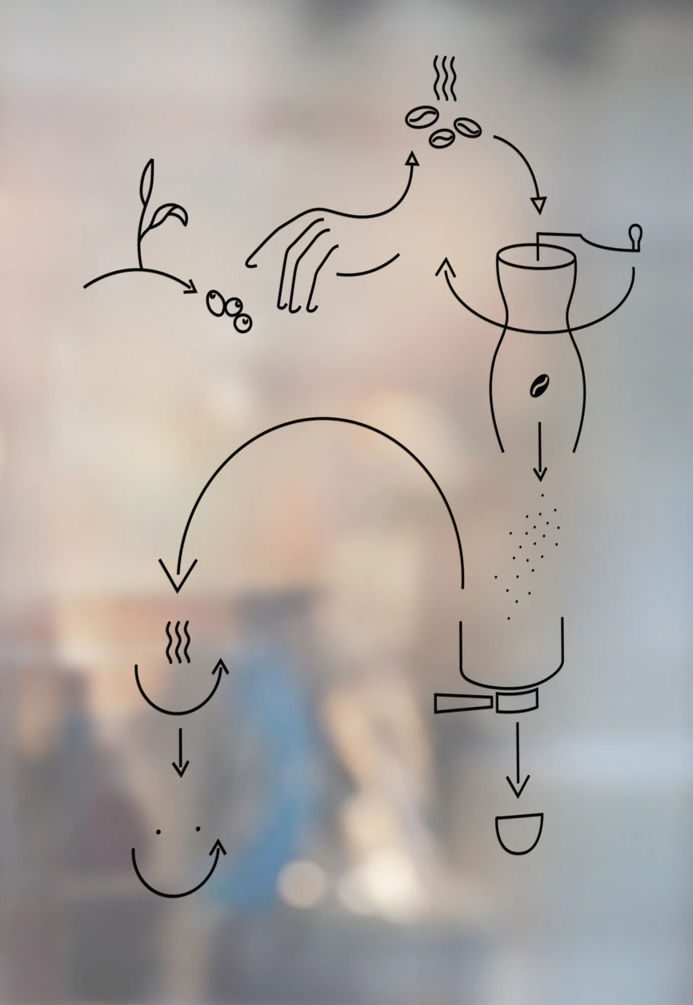
The main element of the identity became arrows, which I work with as a simple graphic symbol of movement, change and process. They can, for example, show the way from a bad mood to a good one, and I also used them for a simple infographic of the coffee-roasting process. The arrow appears in the logo itself, where it forms both the shape of a coffee cup and a stylised smile.
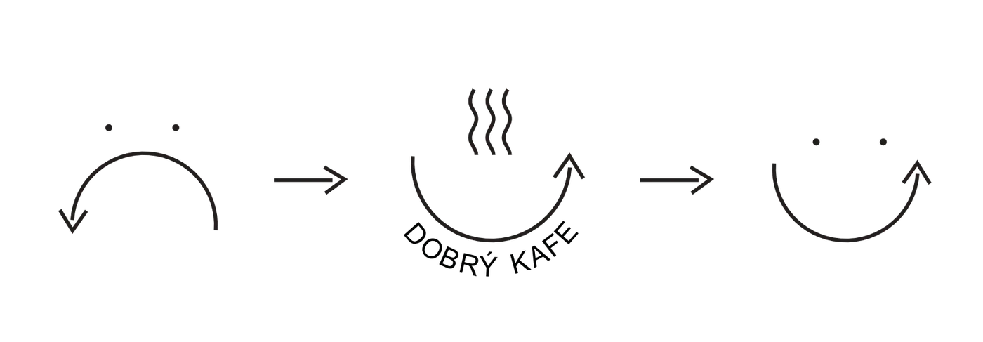
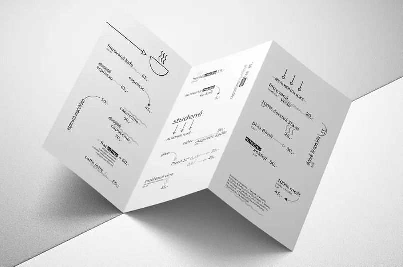
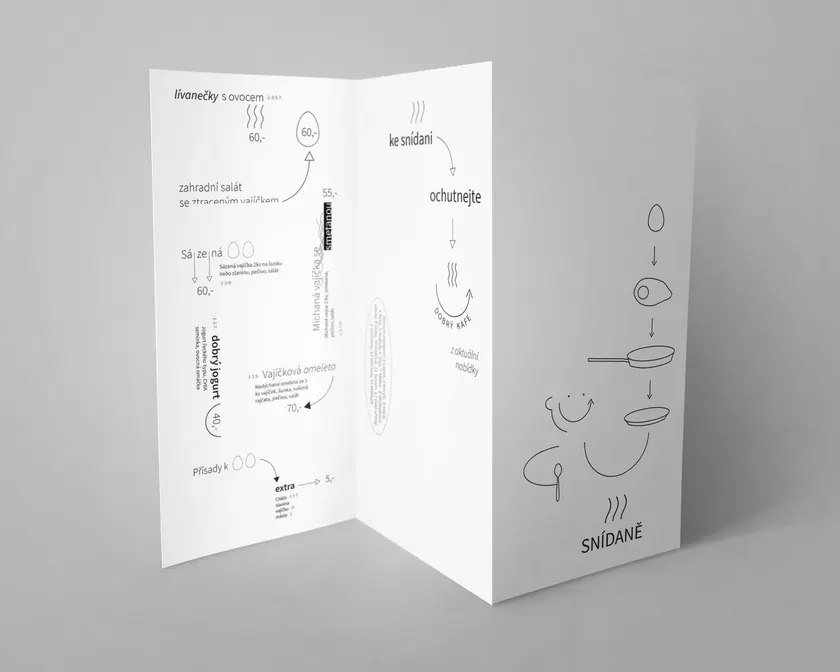
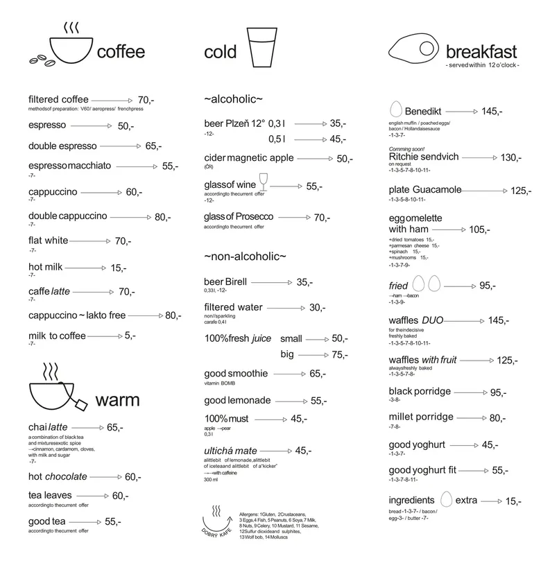
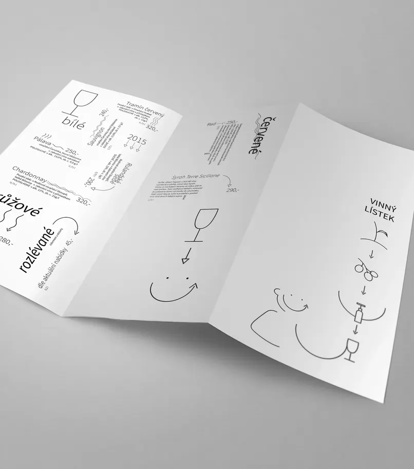
The identity also includes simple vector illustrations and a system for working with typography and wayfinding. I experimented with the visual identity for instance in the design of the menu, where I used arrows and directions to guide the customer through the café’s offering in an unconventional way. I designed the individual elements so they could be used on their own or combined with one another into a single visual system.
The colour scheme is based on black and white, with supporting colours alongside. The result is a simple, bold and easily recognisable identity that connects the graphic system with the atmosphere of the café.