No project with this tag.

No project with this tag.
an author’s book inspired by the Apocalypse
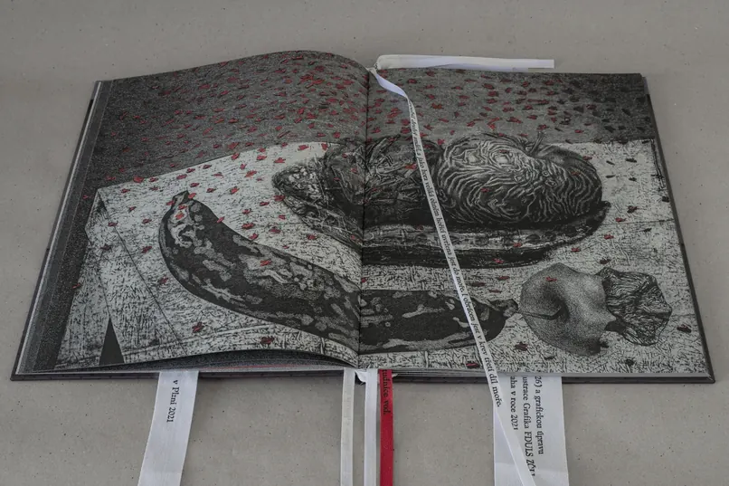
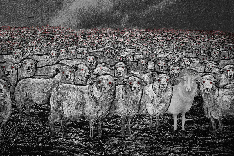
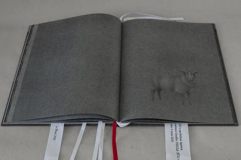
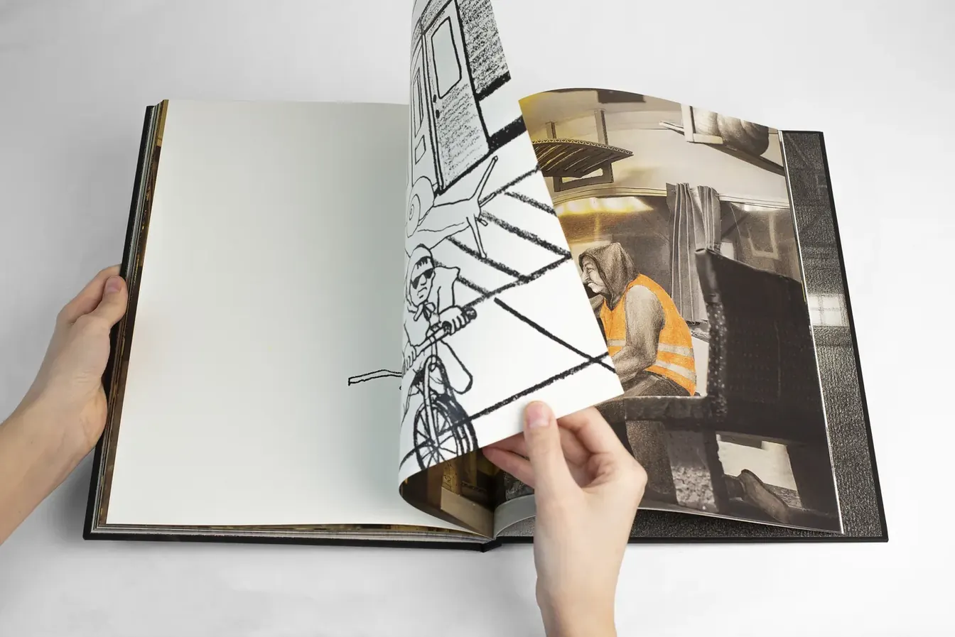
For my bachelor’s project I made an author’s illustrated book loosely based on the text of the Revelation of St John the Theologian (Biblí Svatá, 1926). The text I chose was a powerful source of inspiration for me, not only for its cultural and historical value, but above all for its imagery and the way it works with symbols.
I made the book during covid, when ordinary situations took on entirely new meaning. Announcements over the public address system about curfews, the adrenaline of crossing district boundaries, the gradual move of life into the online world — all of it stirred in me the same atmosphere of uncertainty and anticipation as reading the text of the Apocalypse itself.
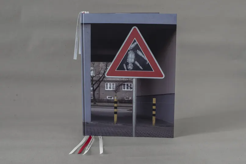
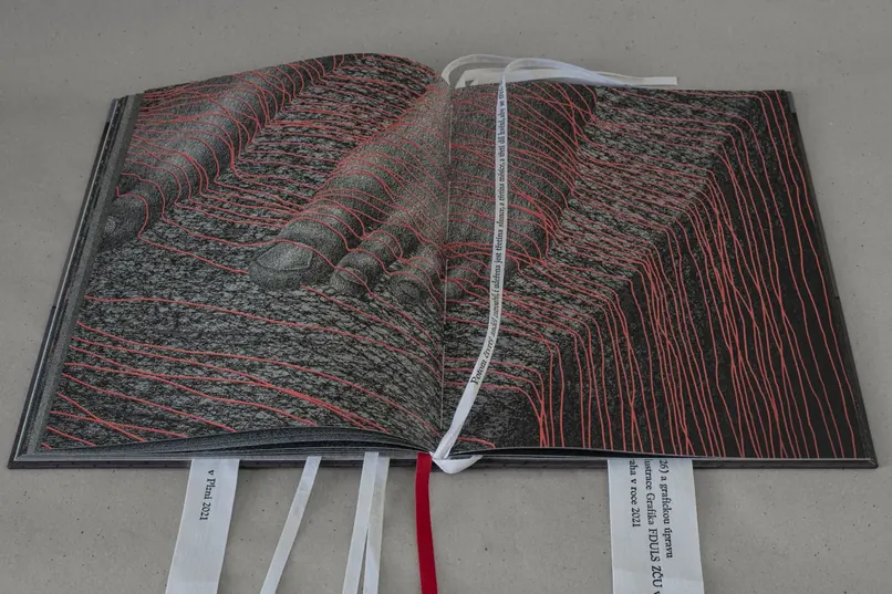
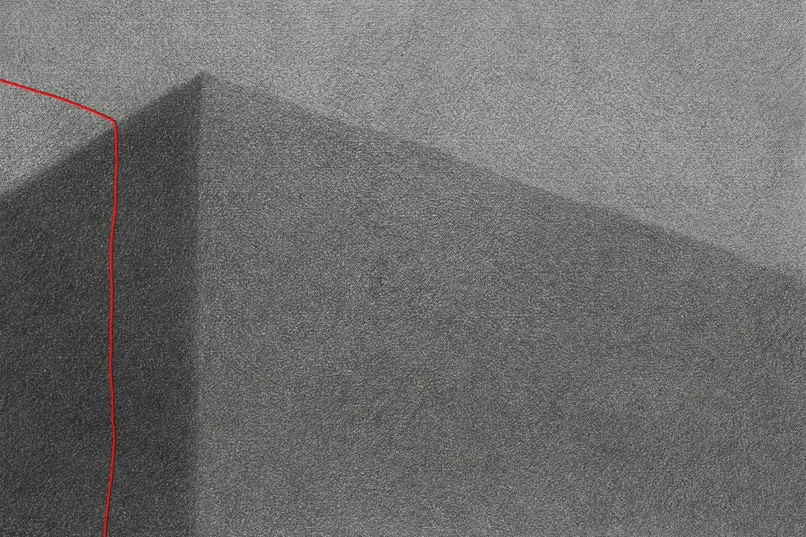
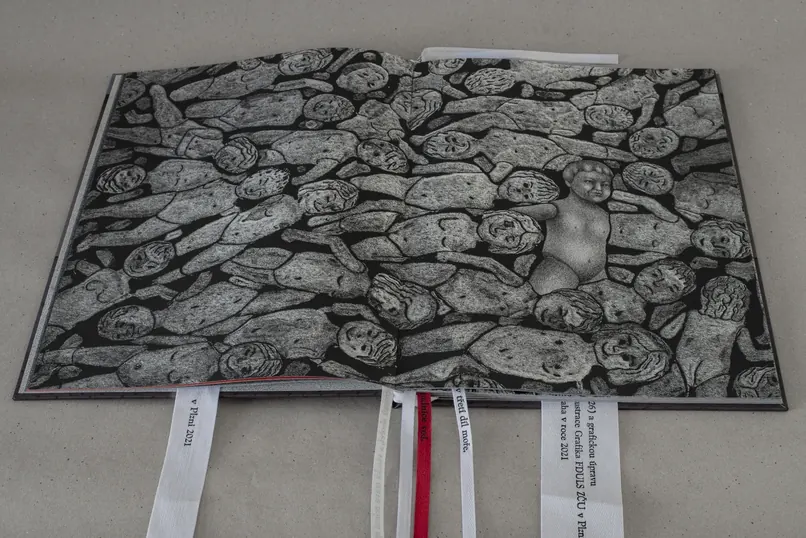
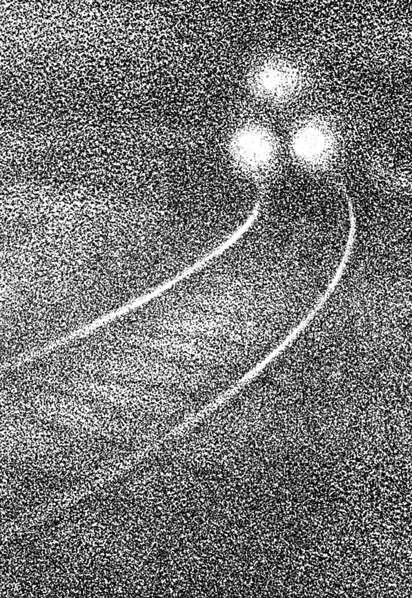
The Revelation of St John is the last book of the New Testament and was probably written at the turn of the 1st and 2nd centuries. It is written in fairly symbolic language, which allows for a great many different interpretations. It describes the eternal struggle between good and evil, light and darkness. I used that same principle in my illustrations, which I conceived as a chiaroscuro wandering through darkness in which light gradually searches for its place.
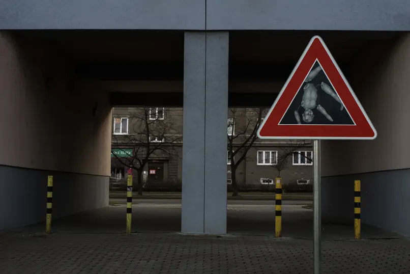
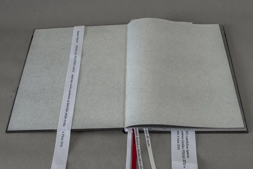
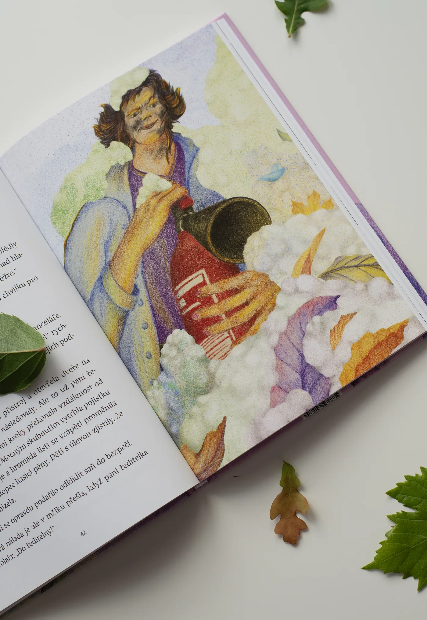
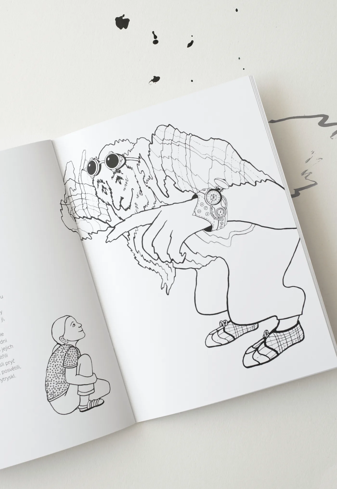
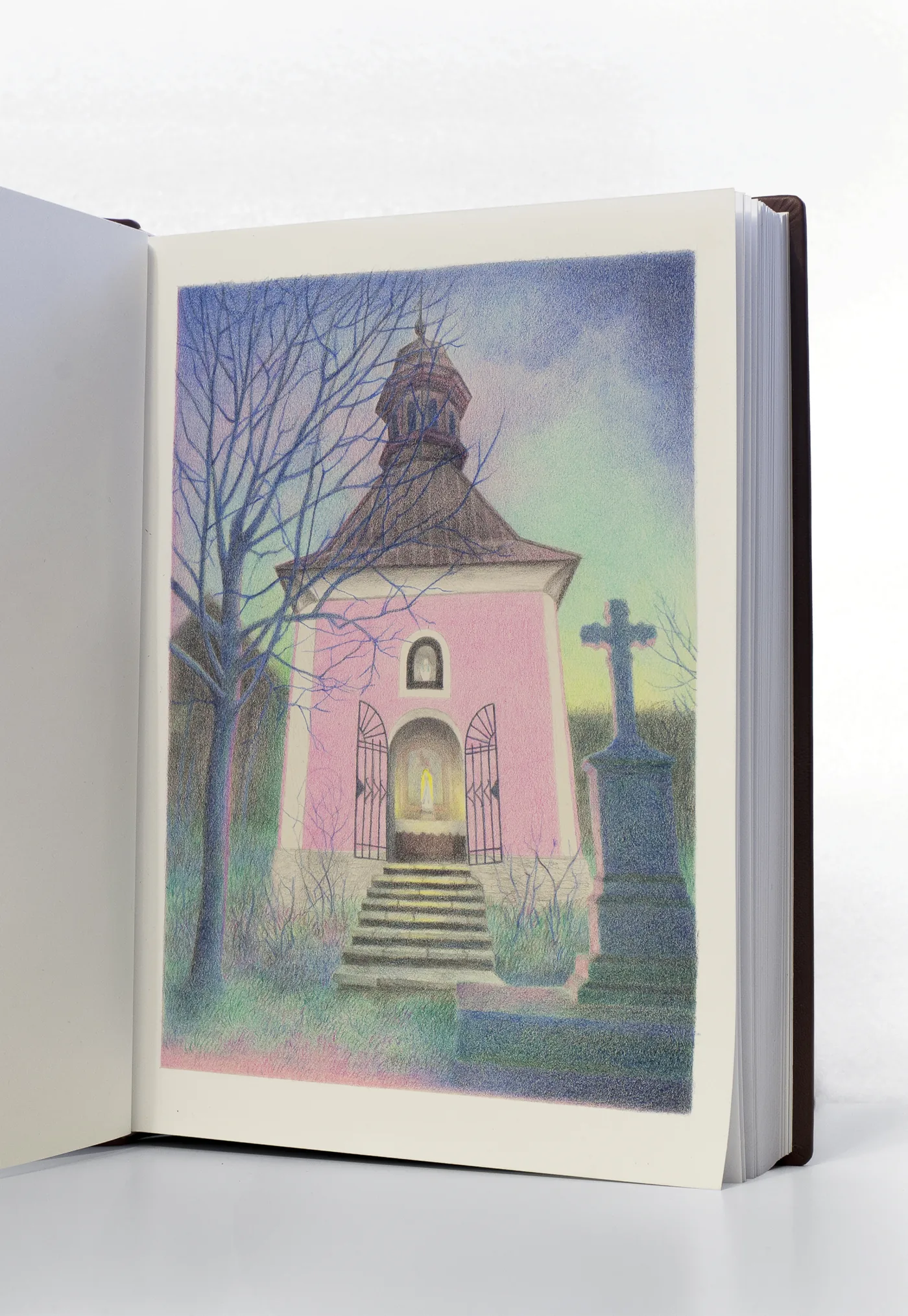
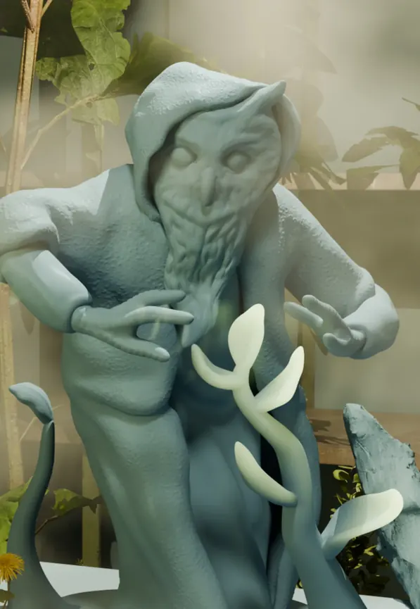
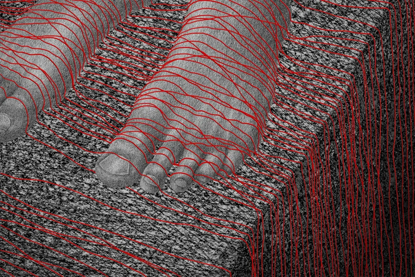
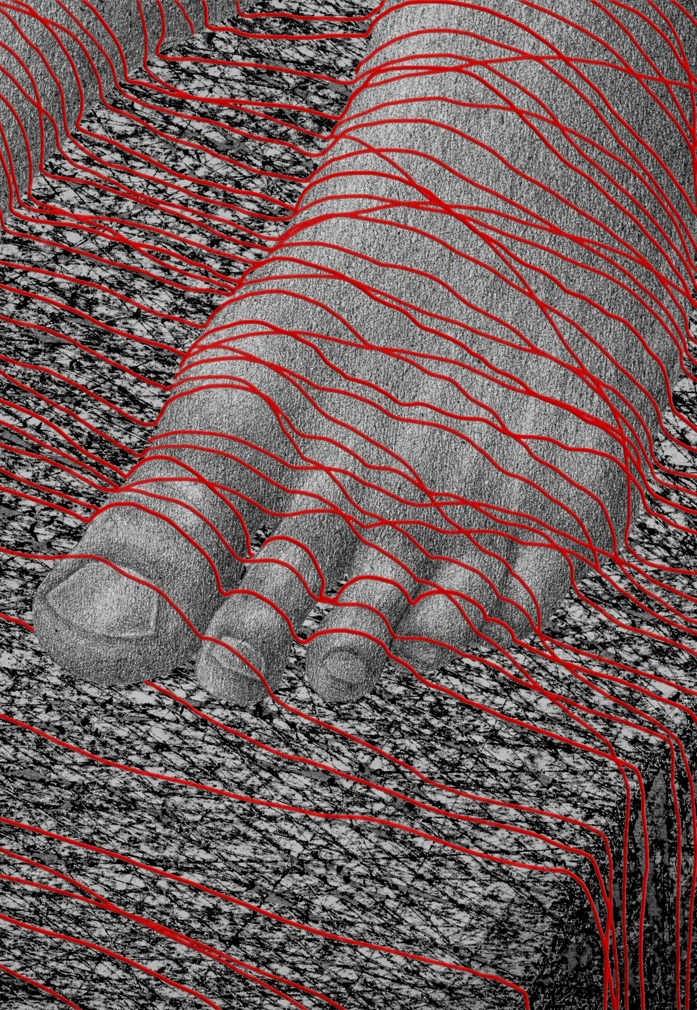
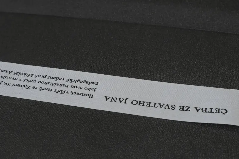
In the illustrations I combined several different media: charcoal drawing, relief on paper, digital drawing, letterpress, a 3D object in the form of a road sign, and photography. A large part of the text appears on the book’s ribbons, so most of the book’s space is given over to the imagery. The ribbons are therefore not only a practical element of the book, but also a carrier of information.
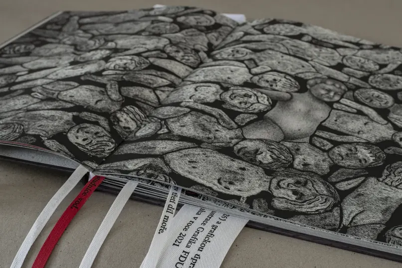
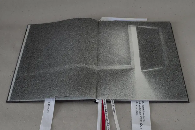
I ruled out straight away the option of depicting the apocalypse as a grand Hollywood spectacle, and tried instead to reach for silence and stillness. What interested me was the calm moment before the storm. That instant when nothing seems to be happening yet, but the tension is already there. I began asking myself: what would an apocalypse look like if it were not accompanied by thunder and lightning, but by inaction and the feeling of time stopped? What if there were silence instead of screaming?
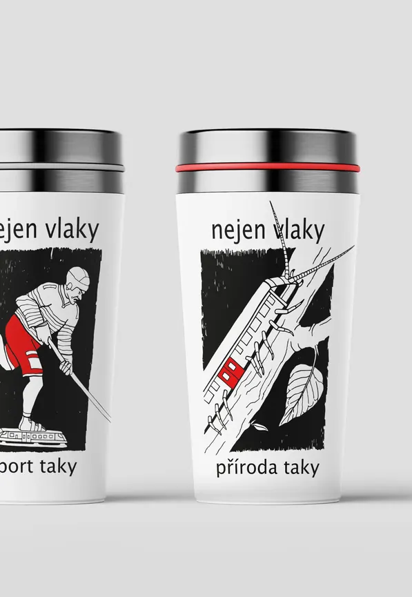
The illustrations in the book are therefore neither aggressive nor dynamic. They work above all with the mutability of light and shadow and with a wealth of different textures. The book’s visual form is made of only three colours: red, black and white. I use the red accents as a warning element, appearing for instance as filaments crossing the boundary of human space, as blinking indicator lights, or as a sign on a housing estate warning of falling childhood.
My aim was to make an author’s illustrated book that would approach the theme of apocalypse more as a space for working with tension, silence and uncertainty. Through a combination of drawing, experimental techniques and typography, my illustrations reflect on the ever-recurring theme of the apocalypse and try to grasp it through contemporary eyes. The book is for anyone looking for quiet places in the middle of a calamity.