No project with this tag.
No project with this tag.
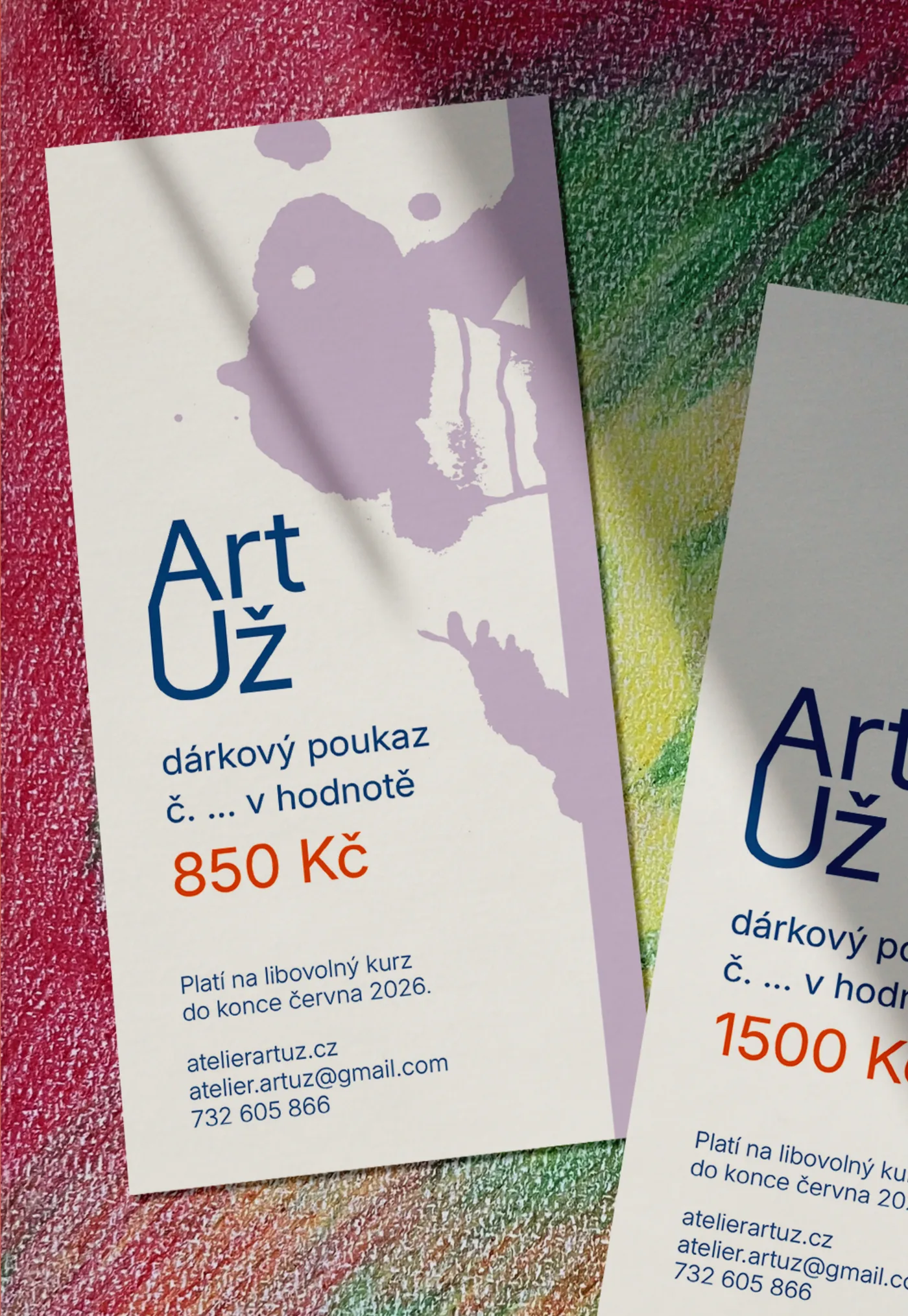
visual identity for an art studio
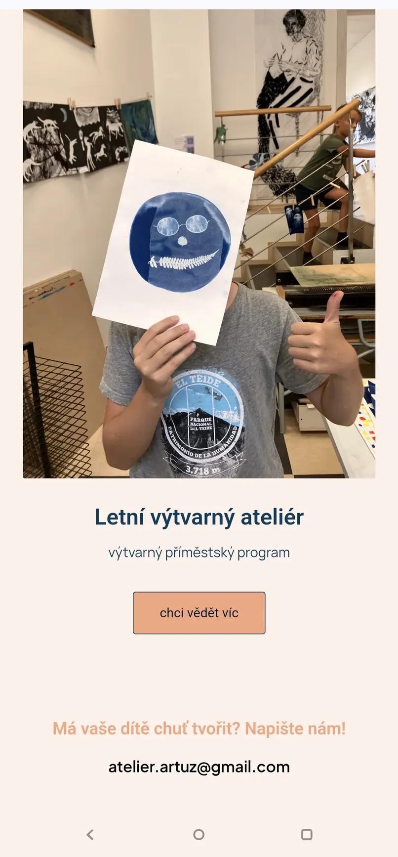
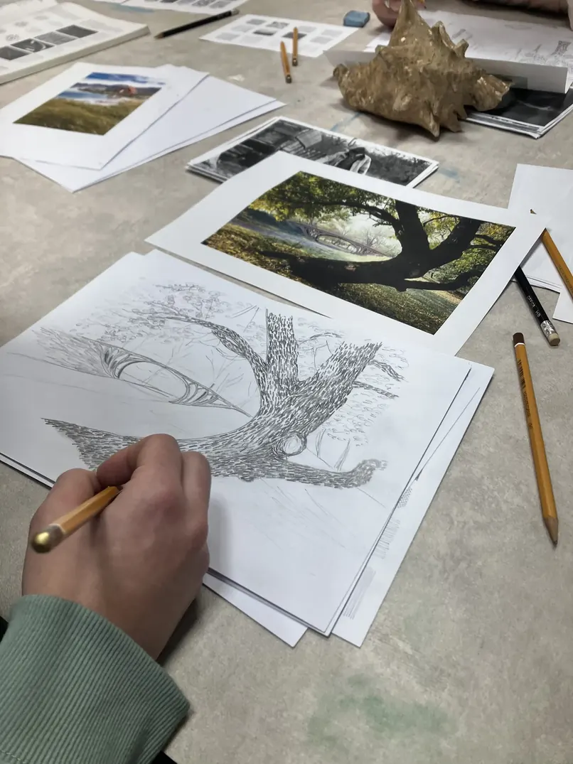
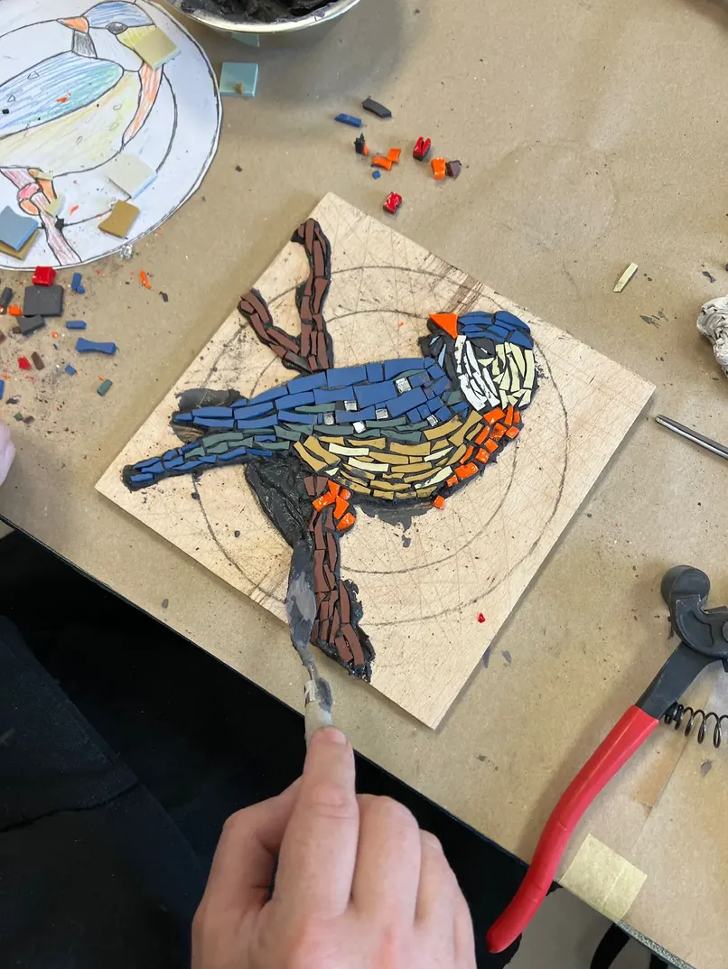
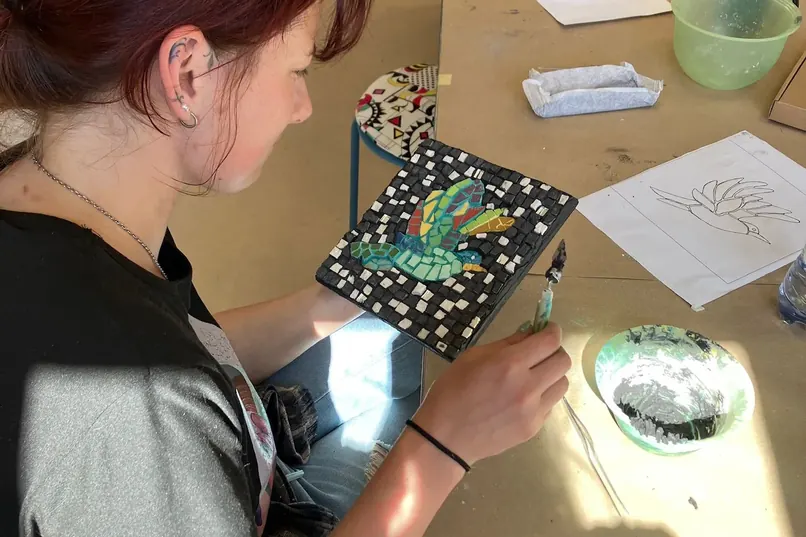
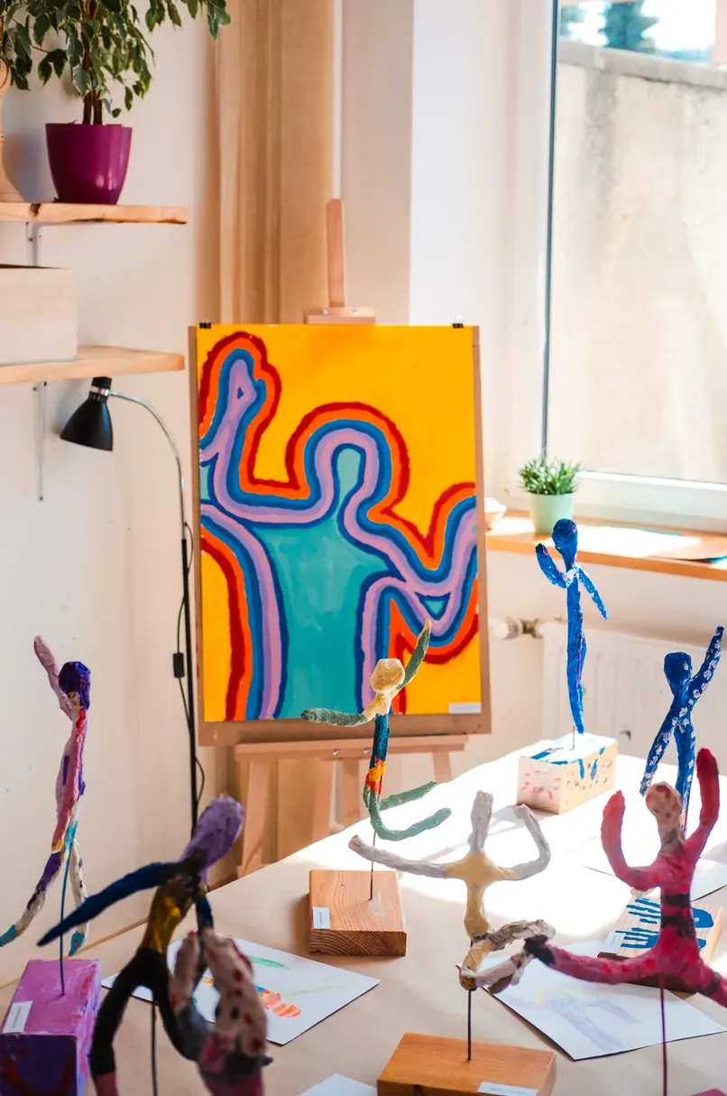
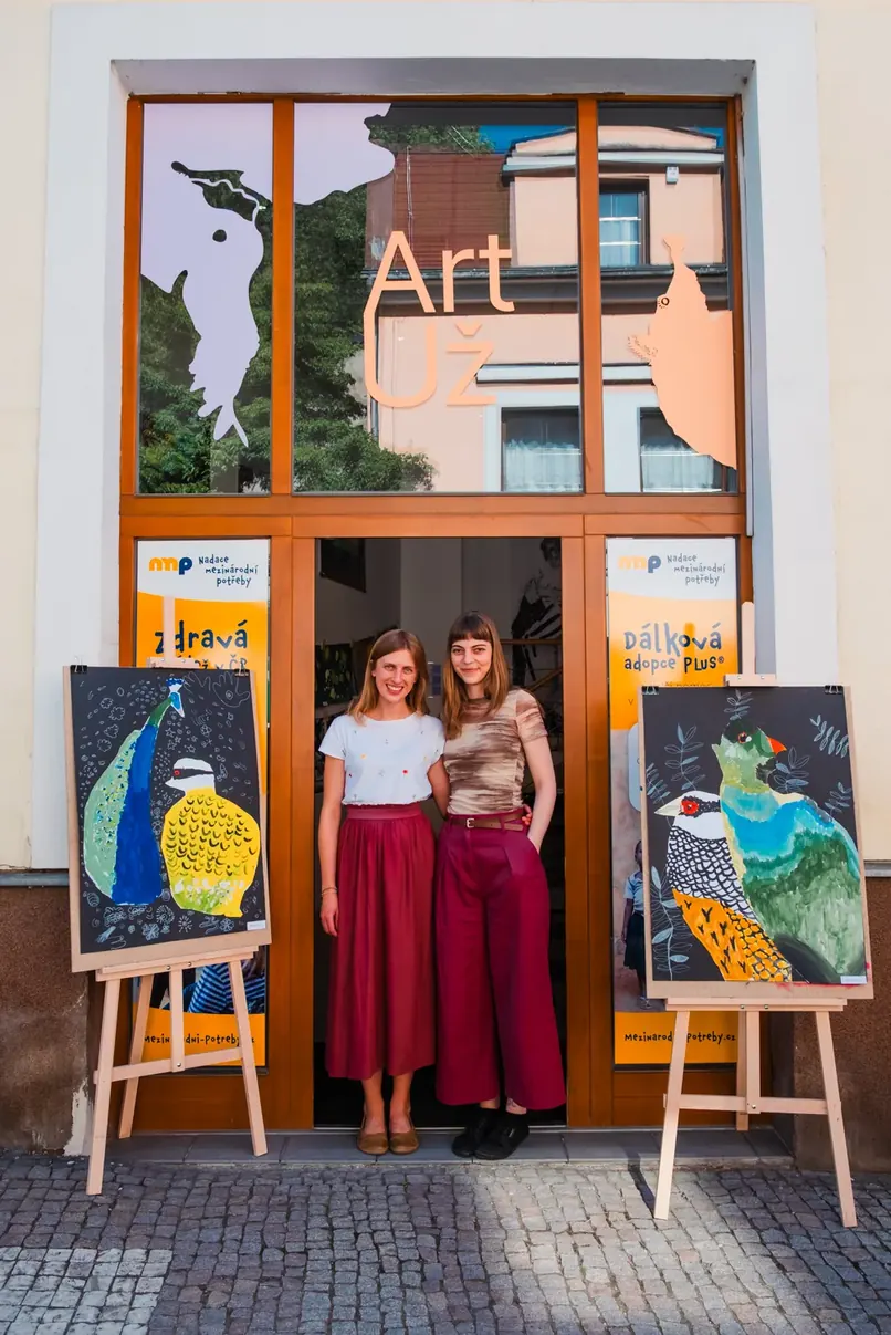
ArtUž is an art studio that my friend Markéta Krásová and I founded in the autumn of 2025 in Česká Třebová. We both come out of our own art education and professional practice, and we wanted to make a place where free creation meets professional artistic guidance. The studio offers courses and workshops for children and adults alike, from drawing and printmaking techniques through mosaic to experimental work.
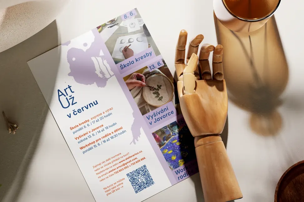
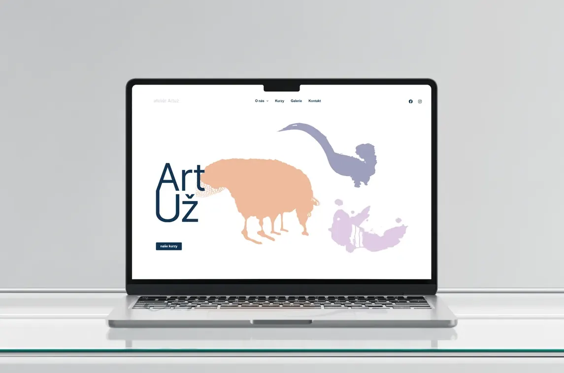
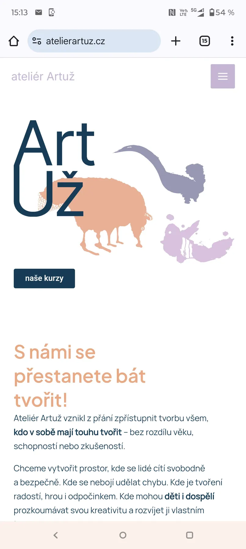
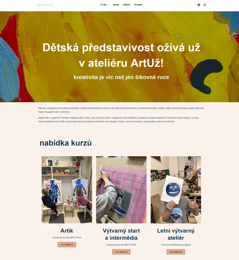
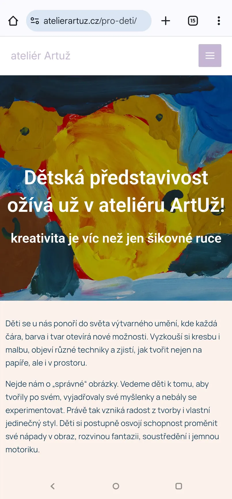
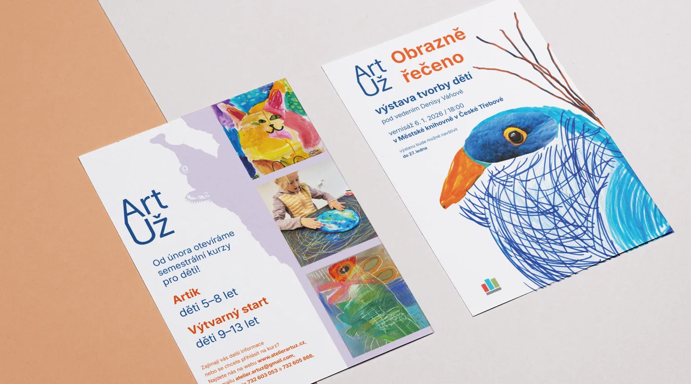
For the studio I created a complete visual identity, including the logo, the graphic system, promotional materials and the website. Because we address a very broad age range, it was important to me to find a balance between childlike playfulness and visual maturity.
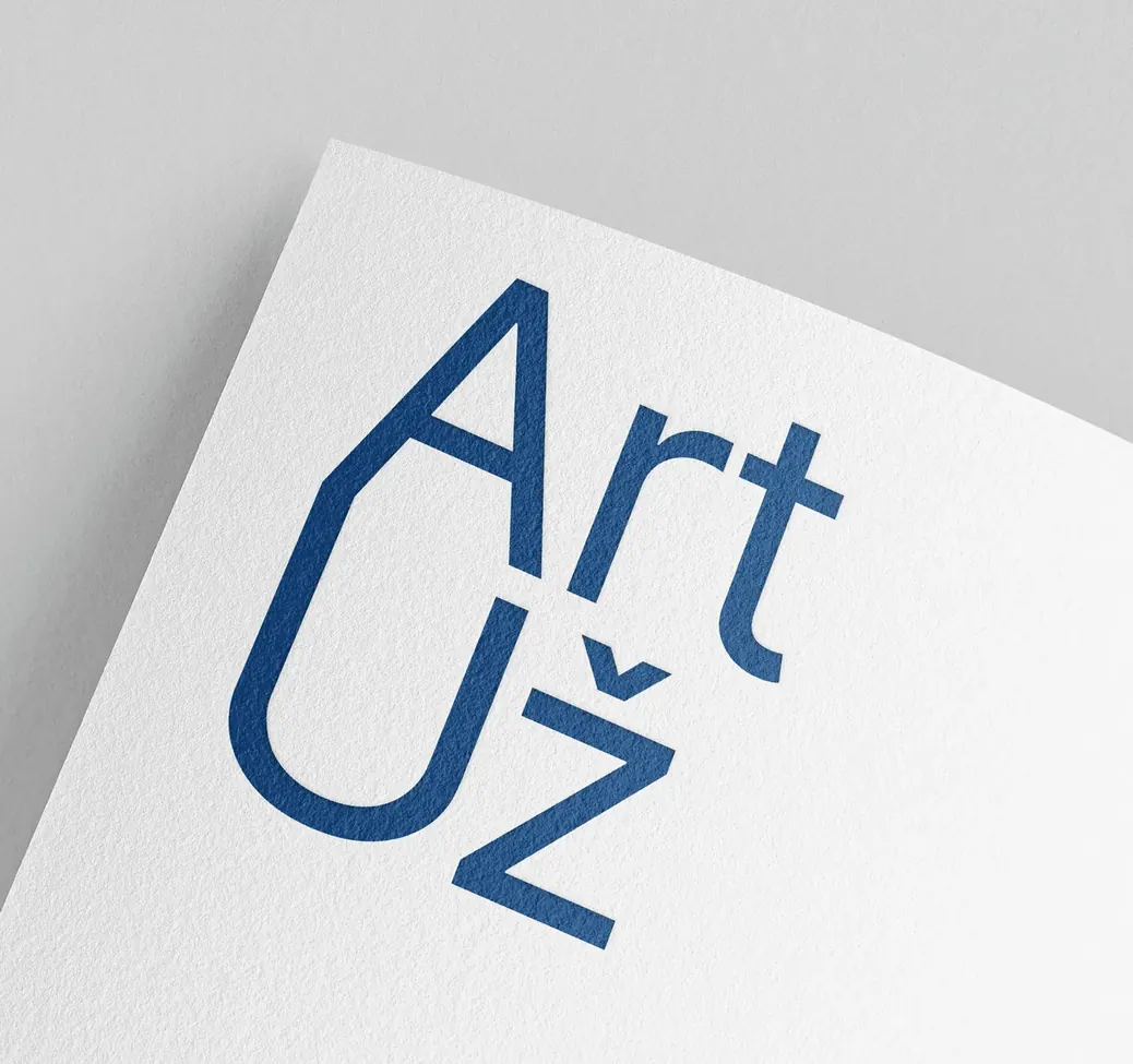
The name ArtUž itself came about as a play on words joining “Art” and “už” — Czech for “already”. We use it in lines such as “Art už teď v ateliéru ArtUž!” — “Art already, right now at the ArtUž studio!”. The name also sounds like a person’s name in the Czech language, which makes it feel more personal and easy to remember. In the logo, joining the letters A and U creates a simple symbol resembling a pencil or a crayon. I did not want a literal illustration of a pencil, though, so its shape is hidden directly in the typography of the name.

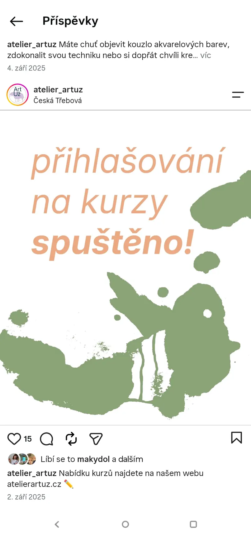
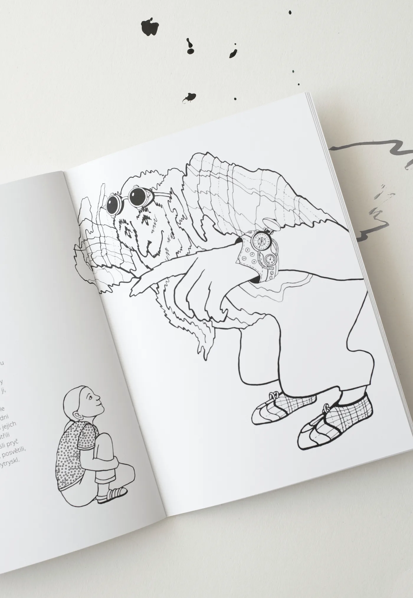
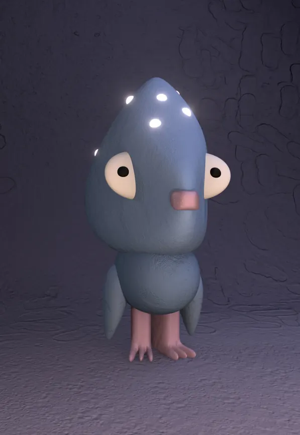
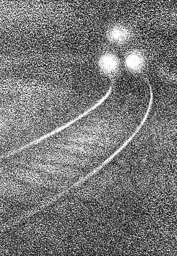
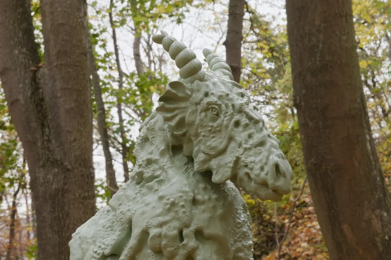
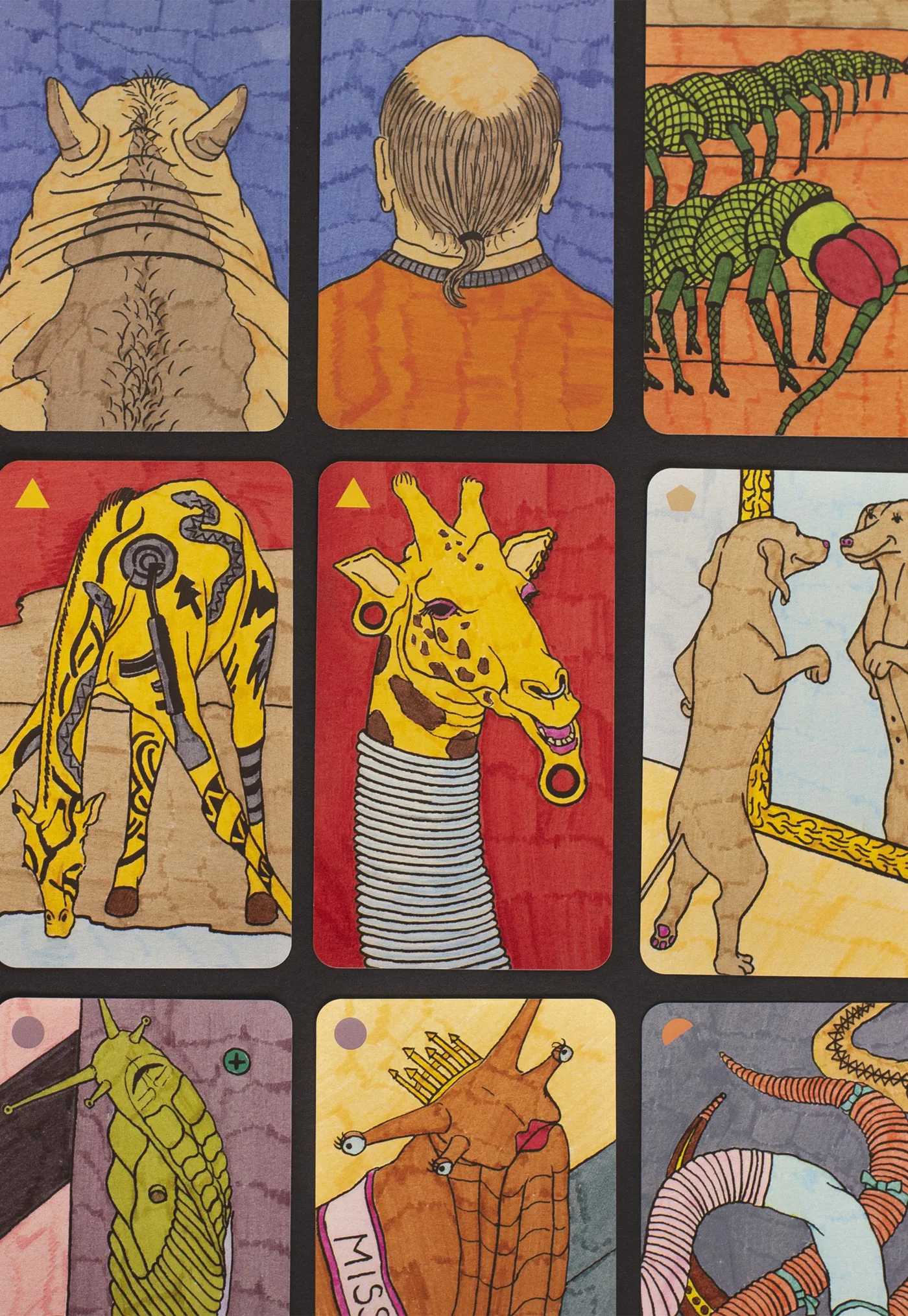
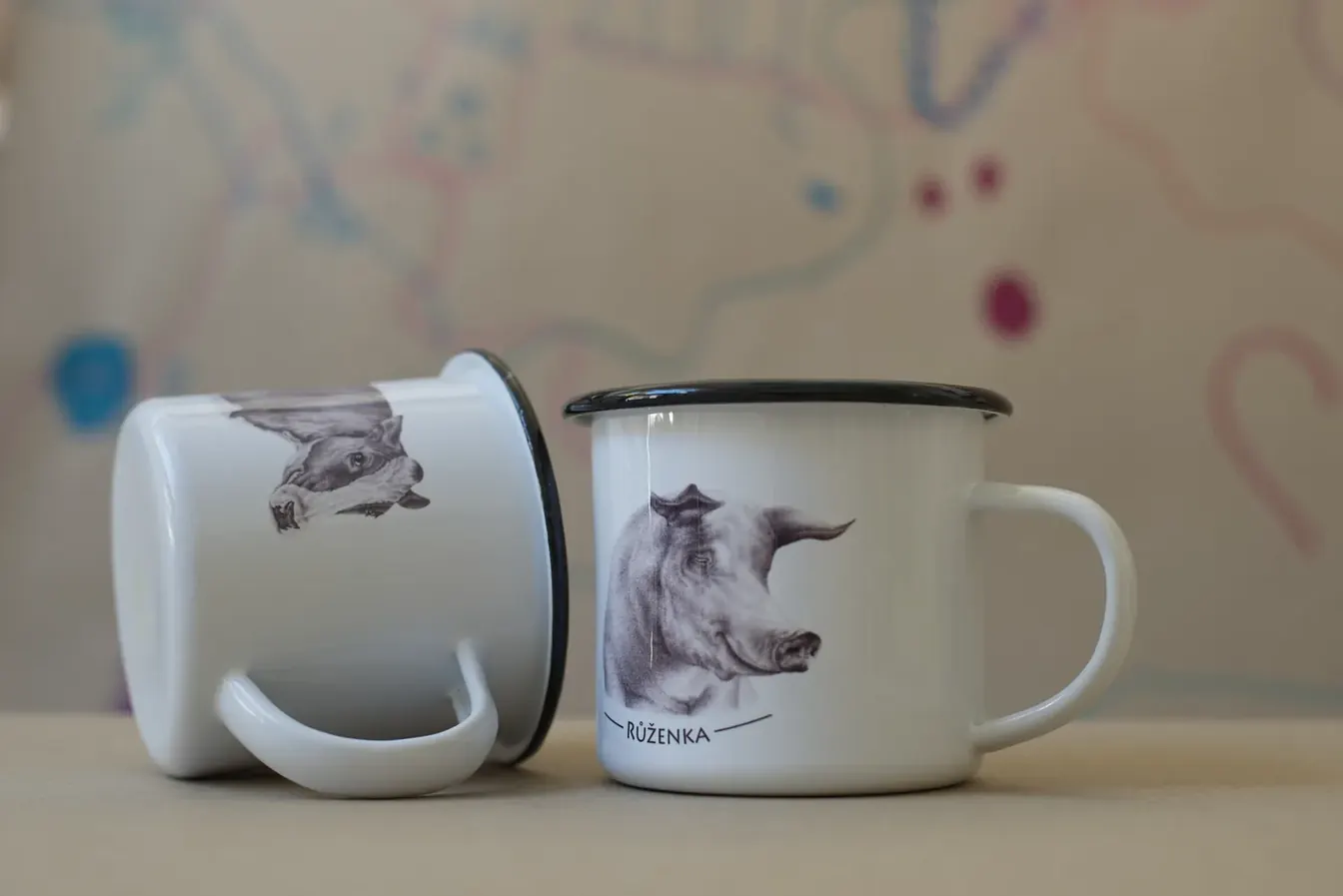
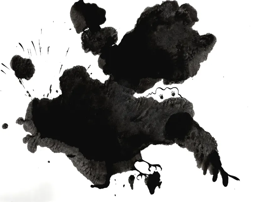
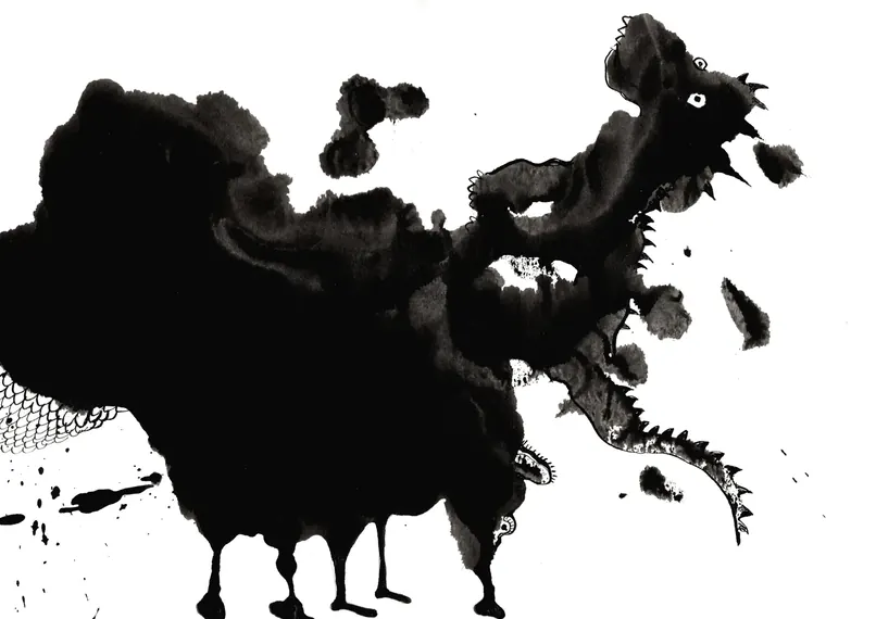
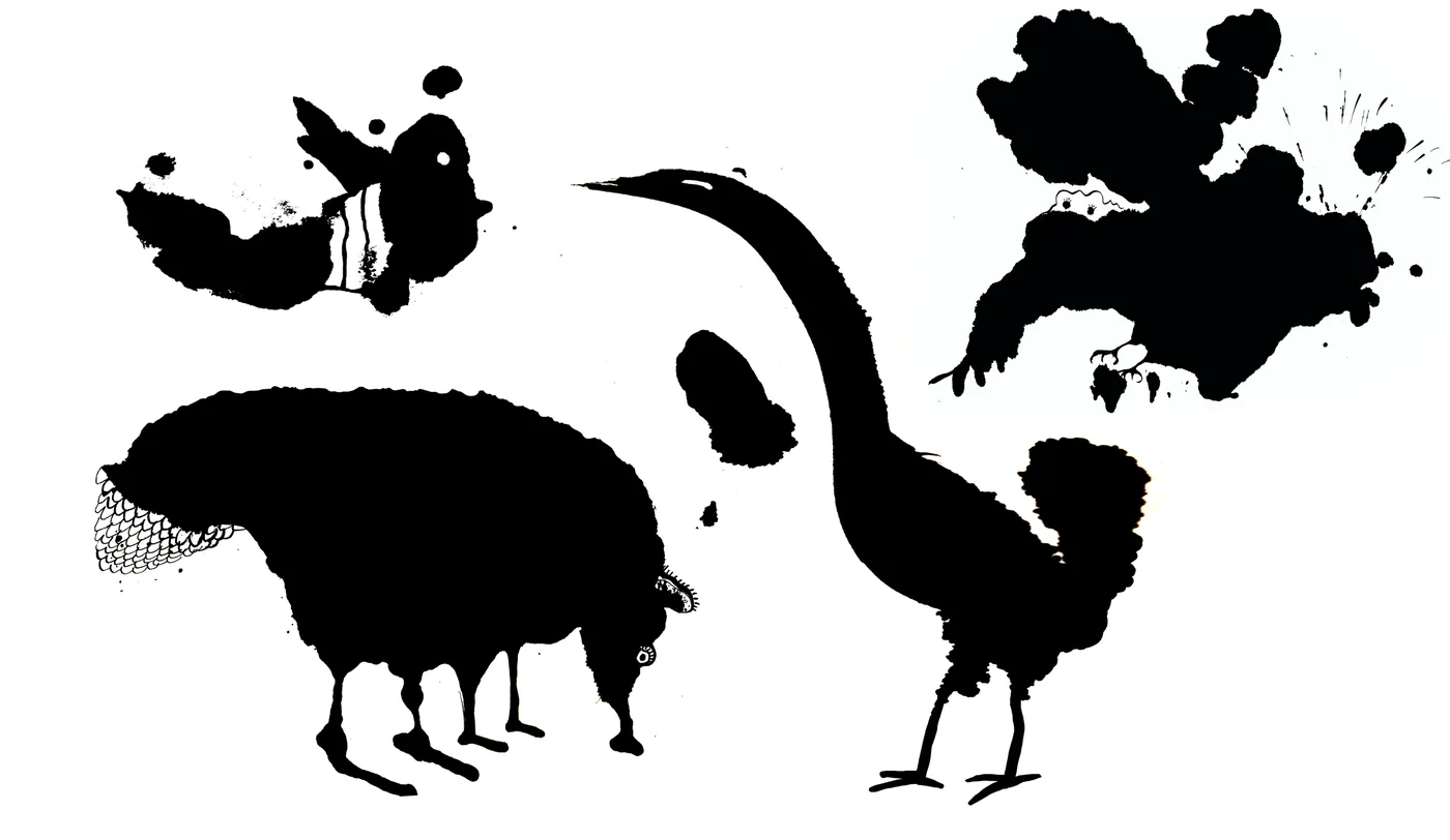
A striking element of the identity are the ink blots — decalcomania — out of which animal mascots emerge. Markéta and I worked on the blots together: I designed the concept, she made the ink blots, and then we both looked for animals in them, which I translated into digital form. These animal characters now appear on posters, on social media and on other materials.
The visual work also includes designing and running the website, built in WordPress. The site presents the studio, lists the courses and handles sign-ups and communication with visitors. According to Google Analytics it currently averages around 100 visitors a month.
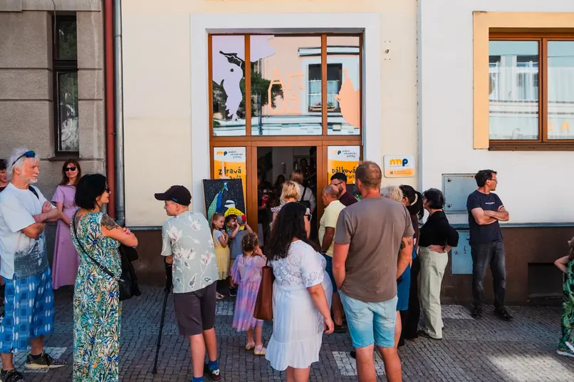
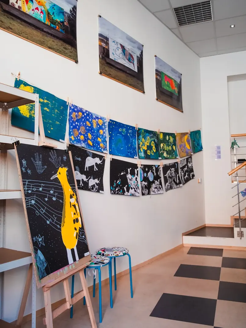
Besides the visual identity, I am also involved in the studio’s day-to-day running. I prepare and lead my own art courses and workshops, I make posters, gift vouchers and other promotional materials, I look after the visual communication and I help organise exhibitions and other events. So the project is not just a branding commission for me, but also a chance to see how a visual identity works in real operation and how it can gradually evolve along with the whole project.